Fusedash vs StatPecker
Side-by-side comparison to help you choose the right product.
Fusedash turns your team's data into clear dashboards so everyone can act on insights together.
Last updated: March 4, 2026

StatPecker
StatPecker delivers rapid AI-driven insights and stunning visuals from your data for impactful storytelling and.
Last updated: March 1, 2026
Visual Comparison
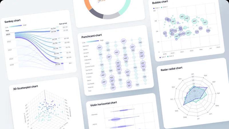
Fusedash
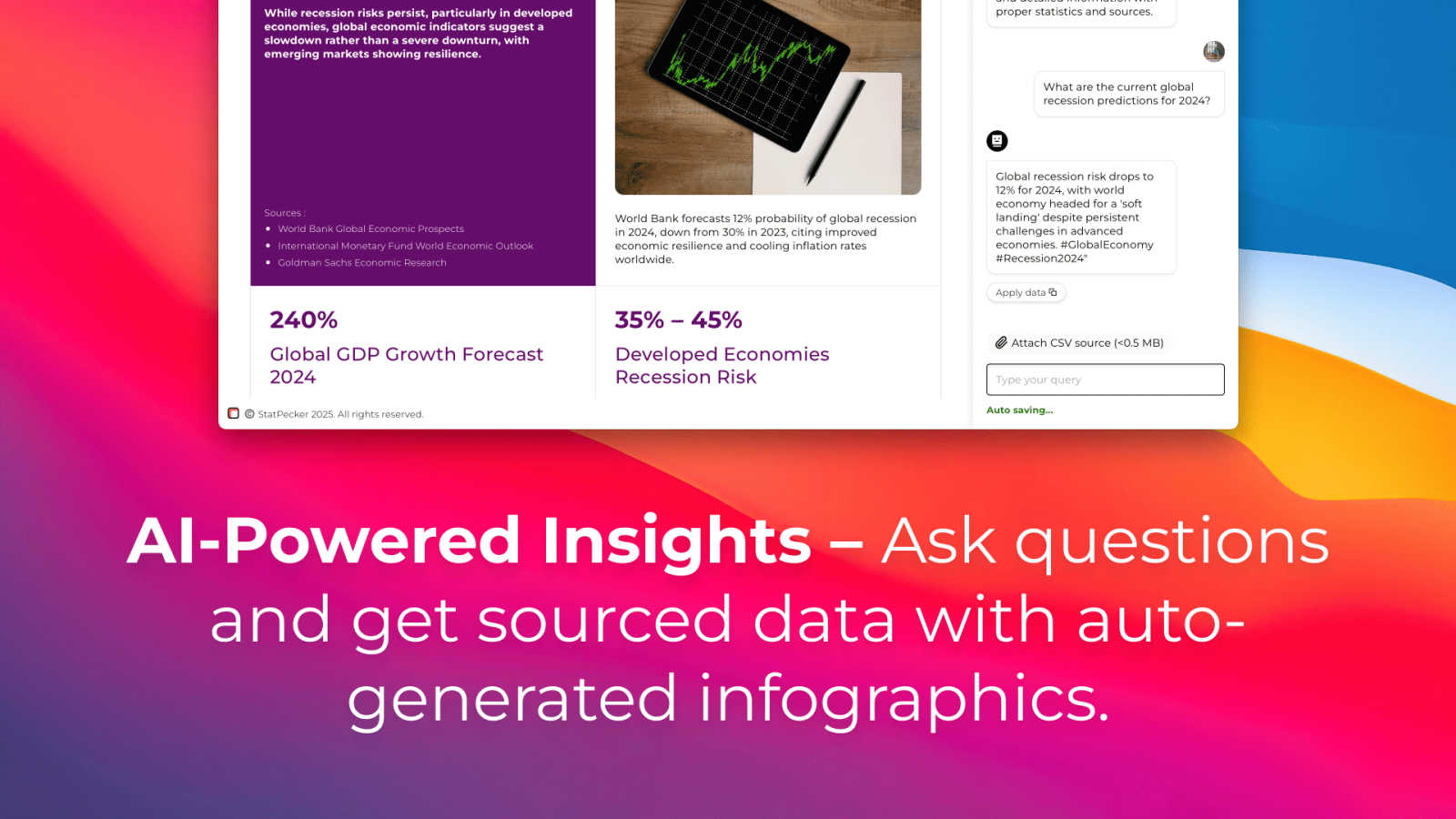
StatPecker
Feature Comparison
Fusedash
Flexible, Unified Workspace
Fusedash provides a single, cohesive workspace where teams can build the right view for every audience without duplicating effort. You can transform the same core dataset into interactive dashboards for real-time monitoring, detailed charts for analysis, narrative reports for stakeholders, or geographic maps for regional insights. This flexibility allows different departments to access the information that matters most to them, all from a consistent data foundation, reducing back-and-forth and ensuring seamless collaboration across the organization.
AI-Powered Chart Generator
Jumpstart your data storytelling with the AI Chart Generator. This feature allows you to create clear, impactful visuals from your CSVs or connected APIs in minutes. The AI assists in selecting the optimal chart type, applying meaningful comparisons, and refining labels to ensure the visual accurately tells your data's story. These charts can be used as powerful standalone assets or seamlessly integrated into larger dashboards and reports, accelerating the path from raw data to shared understanding.
Integrated AI Data Chat
Foster a collaborative exploration environment with the integrated AI Data Chat. Team members can ask questions about their data in plain, natural language, breaking down barriers to analysis. The smart chat can suggest relevant metrics, propose breakdowns, and recommend the best chart types for your inquiry. You can then instantly turn these conversational insights into permanent, shareable dashboard views, making data discovery an intuitive and cooperative process for everyone.
Consistent Metric Definitions & Reusability
At the heart of Fusedash is the principle of consistency. You define your key performance indicators, dimensions, and calculation logic once in a centralized library. These trusted definitions are then automatically reused across every dashboard, chart, and report created on the platform. This eradicates conflicting numbers and manual reconciliation, ensuring that leadership, marketing, and operations are all working from the same trusted dataset, which builds alignment and accelerates collective action.
StatPecker
Ask Your Query
StatPecker allows users to obtain instant insights from validated sources using AI, eliminating the need for complex tools. Users can simply type in their questions and receive quick, credible answers, streamlining the data analysis process.
Publish & Embed
This feature enables users to make their visuals interactive and easily integrate them into blogs, articles, and websites. By enhancing the user experience, StatPecker ensures that the infographics created are not only informative but also engaging for the audience.
Upload & Analyze CSVs
Users can effortlessly upload CSV files of up to 50 MB and explore their data without the hassle of traditional spreadsheets. This feature prioritizes privacy by running analyses on the user's device, ensuring that sensitive information remains secure.
Download & Use Anywhere
StatPecker allows users to export their infographics as images, making it easy to incorporate them into reports, presentations, and other materials. This flexibility means that users can share their insights in a variety of formats without any additional hassle.
Use Cases
Fusedash
Cross-Departmental KPI Alignment
Unify your organization around shared goals by creating a central command center. Leadership can monitor high-level business health on executive dashboards, while marketing drills into campaign performance and operations tracks real-time logistics—all using the same underlying metrics. This eliminates siloed reporting and ensures every team discussion is grounded in a single, consistent version of the truth, driving strategic alignment.
Streamlined Stakeholder Reporting
Transform the tedious monthly reporting cycle into an efficient, collaborative process. Build narrative-driven "storytelling" reports that combine live charts, key metrics, and explanatory text. Share these dynamic reports with stakeholders, who can interact with filters and see the most current data without waiting for a new document. This empowers teams to provide context and clarity, reducing follow-up questions and fostering better-informed decisions.
Collaborative Market & Geographic Analysis
Enable sales and marketing teams to visually analyze performance by region using interactive maps. By combining internal sales data with public demographic or market data within Fusedash, teams can collaboratively identify trends, pinpoint opportunities, and allocate resources effectively. This shared geographic insight helps regional managers and headquarters align on strategy and execute locally relevant actions.
Rapid, Ad-Hoc Data Exploration
Empower every team member to be a data explorer. When a question arises in a meeting, use the AI Data Chat to ask "What drove the sales spike last week?" or "Show me user sign-ups by device type." Instantly generate charts and breakdowns to answer these questions on the fly. This democratizes data access, turns curiosity into immediate insight, and fosters a proactive, data-informed culture across all teams.
StatPecker
Data Visualization for Marketing
Marketers can utilize StatPecker to create eye-catching infographics that summarize campaign performance, customer demographics, and market trends. This visual storytelling approach enhances presentations and makes data more relatable for stakeholders.
Educational Insights
Educators can leverage StatPecker to visualize complex data, such as student performance metrics or curriculum effectiveness. By presenting these insights in engaging formats, they can better communicate findings to students, parents, and administrators.
Business Analytics
Business analysts can use StatPecker to quickly derive insights from sales data, financial reports, and operational metrics. The ability to visualize this data helps teams identify trends and make informed decisions based on real-time information.
Team Collaboration
StatPecker fosters collaboration among teams by allowing multiple users to work on data analysis together. Teams can share insights, create visuals, and collaborate on presentations, ensuring everyone is on the same page and contributing to the overall success.
Overview
About Fusedash
Fusedash is the collaborative AI data visualization platform designed to unify your team around a single source of truth. It transforms the often fragmented process of data analysis and reporting into a streamlined, cooperative workflow. By bringing dashboards, interactive charts, detailed maps, and narrative reports into one connected workspace, Fusedash eliminates the need to rebuild the same logic across multiple, disconnected tools. This platform is built for teams across leadership, marketing, operations, and beyond who are tired of manual reporting cycles, conflicting data stories, and time wasted reconciling numbers. Its core value proposition is consistency and efficiency: you define your key metrics and KPIs once, and then reuse those consistent definitions across every view and report. This ensures everyone in the organization is aligned, looking at the same trusted numbers, and empowered to act. With integrated AI features like natural language data chat and smart visualization assistance, Fusedash makes data exploration accessible to all team members, fostering a culture of shared insight and collaborative decision-making. It’s more than a dashboard tool; it’s a unified workspace where raw data becomes a catalyst for team alignment and decisive action.
About StatPecker
StatPecker is an innovative AI-powered tool that transforms the way individuals and organizations visualize data. Designed for a diverse audience including content creators, analysts, marketers, and educators, StatPecker makes data storytelling accessible to everyone. The platform excels in converting raw data into visually appealing infographics within seconds, enabling users to communicate insights clearly and effectively. With its user-friendly interface, StatPecker allows users to analyze CSV files effortlessly, derive significant insights, and create engaging visuals that captivate audiences. By eliminating the need for manual reporting and expensive design services, StatPecker empowers users to focus on core messages while the robust AI handles the technical aspects of design and data visualization. As a collaborative platform, it fosters teamwork and creativity, ensuring that insights can be shared, published, or presented seamlessly.
Frequently Asked Questions
Fusedash FAQ
What types of data sources can I connect to Fusedash?
Fusedash is built for flexibility in data integration. You can start by uploading CSV files directly for quick analysis. For live, updated data, you can connect to various business applications and databases via their APIs. The platform also allows you to enrich your internal data with relevant public datasets, especially useful for adding geographic or market context to your visualizations and reports.
How does Fusedash ensure data consistency across teams?
Fusedash uses a centralized metric definition system. Your team defines each key metric, KPI, and dimension (like "Monthly Recurring Revenue" or "Active User") once in a shared library. Whenever anyone builds a dashboard, chart, or report, they select from these pre-defined, trusted metrics. This guarantees that the calculation logic is identical everywhere, eliminating discrepancies and ensuring everyone analyzes and debates using the same numbers.
Can I use Fusedash just to create single charts, or do I need to build full dashboards?
Absolutely, you can use Fusedash for both. The AI Chart Generator is perfect for creating standalone, publication-ready charts quickly from your data. If you need a comprehensive view, you can then assemble those charts and more into a full dashboard. The platform is designed to support your workflow, whether you need a single visual for a presentation or a live monitoring interface for your entire team.
What makes Fusedash's AI features different?
Fusedash's AI is integrated directly into the collaborative workflow. The AI Data Chat lets you interact with your data conversationally, making exploration accessible to non-technical team members. The chart AI suggests the best ways to visualize your specific data. Crucially, these AI insights aren't dead-ends; you can instantly convert chat answers and generated charts into persistent, shareable views within your team's workspace, turning fleeting discoveries into institutional knowledge.
StatPecker FAQ
What types of files can I upload to StatPecker?
StatPecker allows users to upload CSV files of up to 50 MB. This feature enables users to analyze their data without the need for additional software or complex tools.
Is my data safe when using StatPecker?
Yes, StatPecker prioritizes user privacy by conducting all data analyses on your device. Your data remains secure and is not shared with external servers during the analysis process.
Can I integrate StatPecker visuals into my website?
Absolutely! StatPecker provides options to publish and embed your created infographics into blogs, articles, and websites, enhancing your content with engaging visuals.
What support options are available if I encounter issues?
StatPecker offers support through its website, where users can access help resources and contact the support team for assistance with any issues they may face while using the platform.
Alternatives
Fusedash Alternatives
Fusedash is an AI-powered data visualization and business intelligence platform. It helps teams unify their data sources to create consistent, decision-ready dashboards and reports, fostering a collaborative environment where everyone works from a single source of truth. Teams explore alternatives for various reasons, such as budget constraints, specific feature requirements, or the need to integrate with a different tech stack. The search often stems from a desire to find a tool that aligns perfectly with their team's unique workflow and data maturity. When evaluating options, consider how a platform promotes team synergy. Look for tools that ensure metric consistency, reduce manual reporting work, and offer intuitive ways for everyone to explore data and share insights, turning information into aligned action.
StatPecker Alternatives
StatPecker is a cutting-edge AI-powered tool that specializes in data visualization, transforming raw data into visually appealing infographics in a matter of seconds. This platform is designed for a diverse range of users, from content creators to educators, making data storytelling accessible and engaging. As businesses and individuals seek efficient ways to present their data, many users find themselves exploring alternatives that may better fit their unique needs or budget constraints. When searching for alternatives to StatPecker, users often consider factors such as pricing, specific features, and compatibility with their existing platforms. It's essential to evaluate what functionalities are most important, whether it's ease of use, collaborative capabilities, or advanced analytical tools. A suitable alternative should align with the user's objectives and enhance their data visualization experience without sacrificing quality or efficiency.